CitySwift


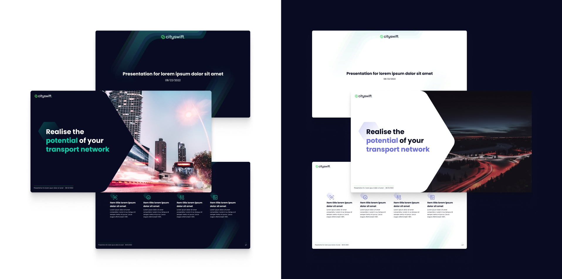
CitySwift, a company close to our hearts, has been a partner with us since its inception. In the early days, we aided in creating presentations for potential stakeholders, which marked the starting point of their journey towards becoming one of the most successful companies in Galway, Ireland.
CitySwift operates as an intelligent transport data platform, supplying bus network providers with critical real-time insights required to manage and adjust their networks. Our studio came into play post their initial rebranding phase, moving away from their old color scheme and logo to enhance their visual identity.
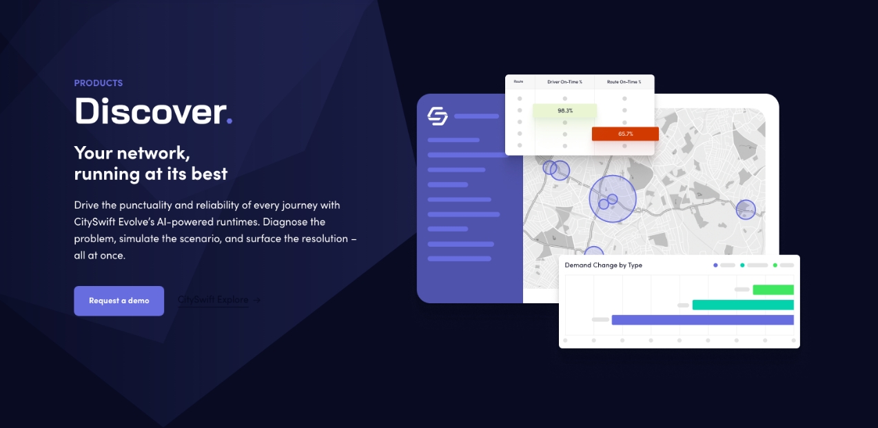
We didn’t just stop there. We also dipped our toes into UX/UI design, crafting their first platform design and providing assistance with their product design. This journey gave us an in-depth understanding of their core product and their approach to prospective clients, a crucial factor in executing their vision.
The meticulous iterative branding design process was an intriguing journey. Typically, our creative process remains a studio secret. However, in this case, we allowed CitySwift to peek into our world of ideas and sketches.
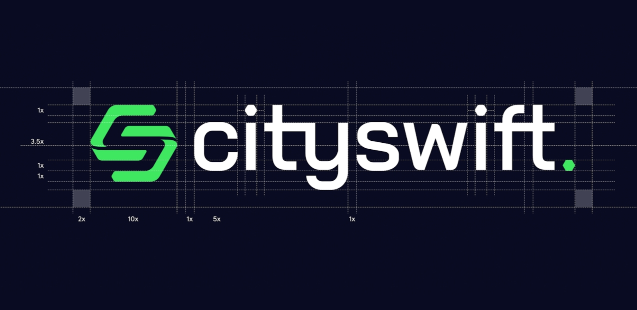
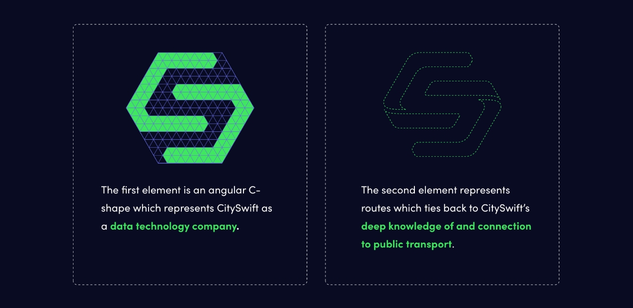
Embarking on a new visual identity, particularly a logo, is crucial for robust brand recognition. Our creative team proposed over 100 logo designs, with some standing out as we deconstructed the leadership vision. The logo design was a relentless pursuit to encapsulate the brand’s personality and values. This was achieved through numerous workshops where we outlined the goals, vision, and how the logo would embody these aspects.
Interestingly, CitySwift’s directors insisted on an hexagonal logo. It’s a common shape, often favored by tech companies, making it challenging to differentiate the brand. However, the versatility of this elementary shape brought forth a plethora of design possibilities, sparking a flurry of ideas and concepts among our team.
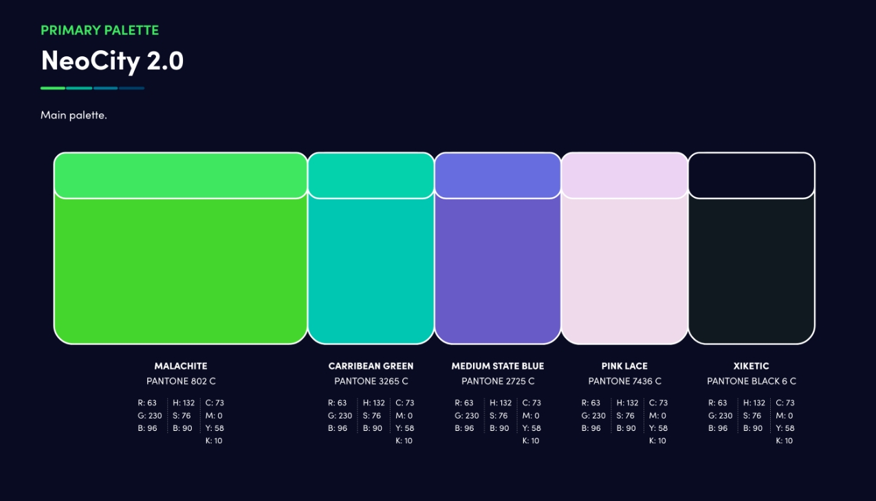
Following the logo design, the color scheme, and typography, we compiled a comprehensive brand book spanning over 40 pages, documenting all the essentials about the brand and its usage.
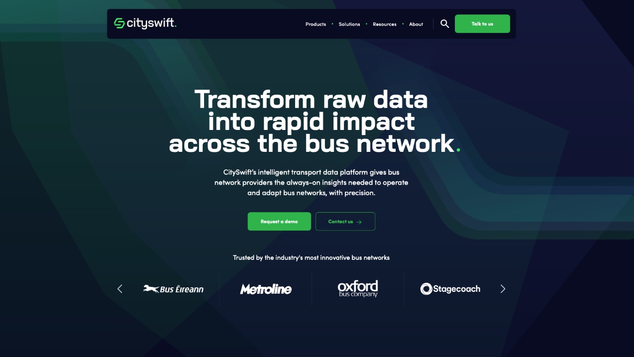
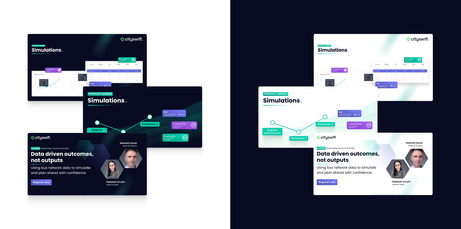
The next task was to design their website. We found it crucial to use a modern stack and a user-friendly CMS. The first phase of the web design was a clean, pure, and white design. However, nearly two years later, CitySwift’s team was keen on exploring a dark mode. The dark undertones of the brand book had already caught their fancy. The original colors popped brilliantly against the dark background, leading to a full transition to a dark theme.
To further illustrate the website content, we created over 30 animations across the site. Some of these animations are synchronized to the scrolling, unveiling information as one navigates down the site.
Our partnership with CitySwift since 2017 has been a rewarding experience. We continue to strive to enhance the online experience of the site visitors, paired with a brand identity that the founders are fond of.

Julien Garrigues
Tiphaine Di Valentin
Julien Ehrhardt

